
Designing a clearer path from discovery to enrollment
Transforming fragmented content and a high-friction registration process into one accessible, confidence-building experience.
My Role
UX/UI Designer
Tools
Figma, Miro, Adobe Photoshop
Timeline
3 weeks
Methodology
Stanford Design Thinking
TL;DR — McMaster’s UX/UI program website forced prospective students to navigate fragmented content before completing a 13-step registration process. I redesigned the experience into a single, confidence-building journey, consolidating five entry points and reducing registration from 13 steps to one guided experience while improving clarity, accessibility, and trust.
The Opportunity
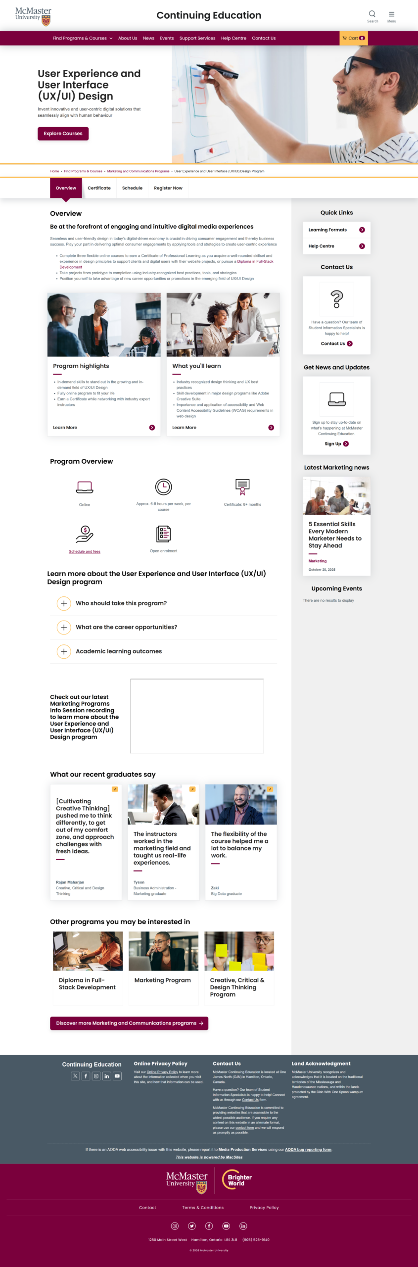
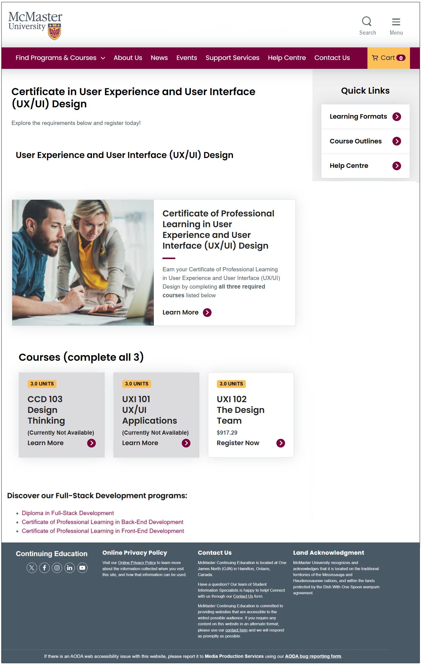
Enrolling in McMaster’s UX/UI program required unnecessary effort. Before students could even register, they had to piece together key information across multiple pages with inconsistent hierarchy, navigation, and messaging. Those who decided to continue then faced a 13-step registration process that introduced friction at every stage.
For working professionals making a significant investment in their education, every unnecessary click increased uncertainty. The opportunity was to reduce friction, consolidate information, and create a clear, confidence-building path from discovery to enrollment.
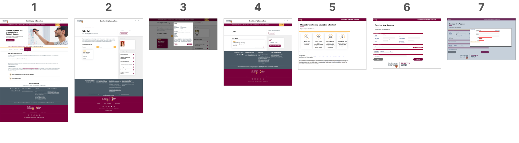
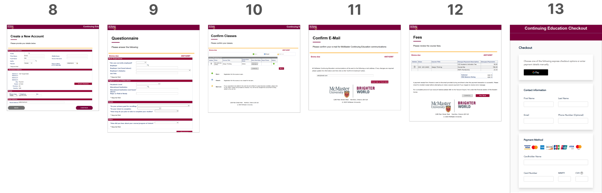
The original registration flow spanned 13 separate, sequential pages, with no progress indicators, limited autofill, and technical error messages — creating unnecessary cognitive load and increasing abandonment risk.
Research
and Discovery
Research combined competitor analysis (UBC and SFU), surveys of more than 50 prospective students, informal interviews with working professionals, and secondary research.
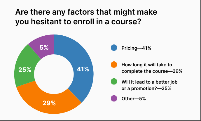
Across every method, the same pattern emerged: users first wanted to understand the curriculum, cost, and time commitment before beginning registration. Fragmented content and a lengthy registration flow undermined confidence at precisely the moment trust mattered most.
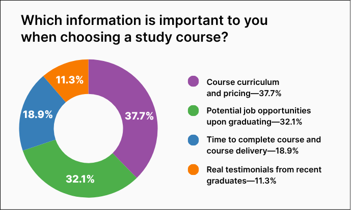
In keeping with UX best practices, these charts use only high contrast, colourblind-safe colours
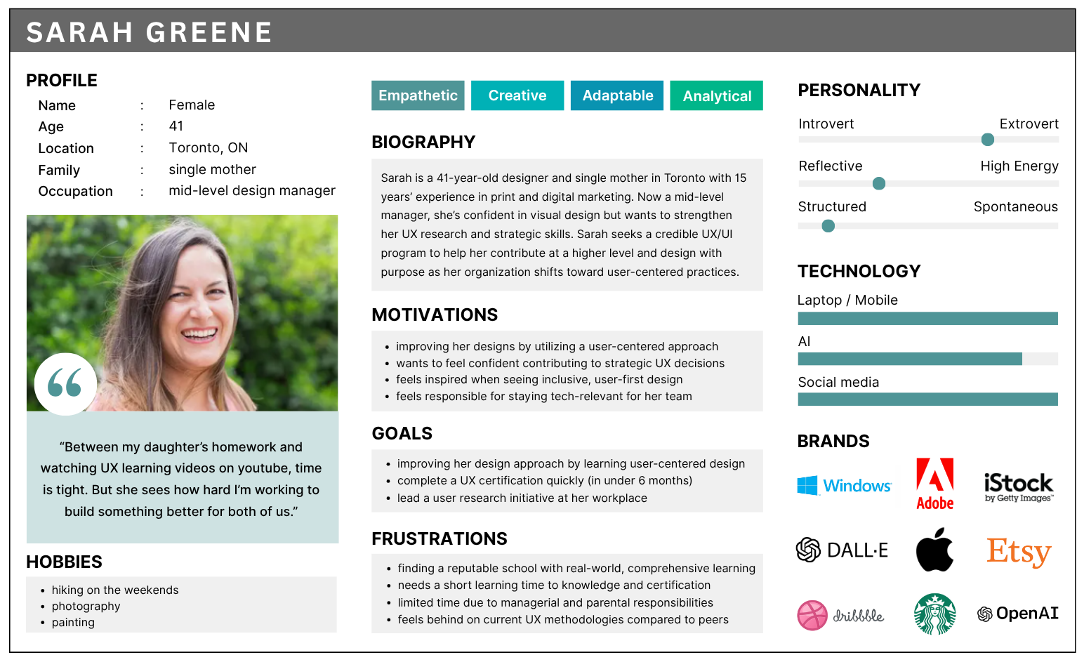
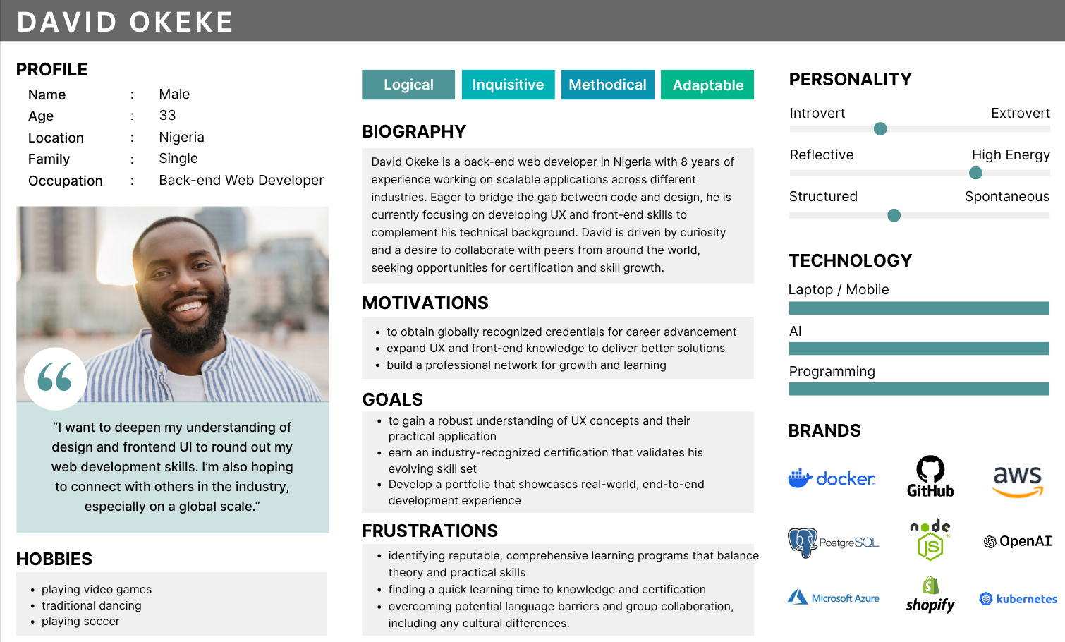
Research findings and personas: Keeping Sarah and David in mind, the goal was to simplify registration, reduce friction, and make the process intuitive for all students.
Strategy
- Simplify registration by removing unnecessary steps
- Consolidate information into a single source of truth.
- Build trust through testimonials, outcomes, and credibility signals.
- Build confidence through clarity, accessibility, and credible content.
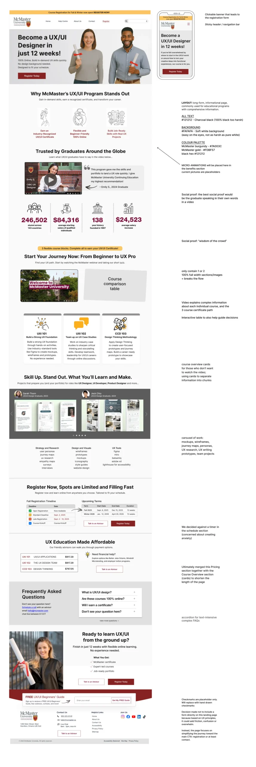
Annotated mockup outlining key design decisions behind the redesigned UX/UI program landing page, highlighting improvements to hierarchy, clarity, and the overall registration experience.
Design Decisions
Every decision directly addressed a barrier identified during research.
Registration Flow
13 steps → 1 guided experience
The original registration required users to navigate thirteen sequential screens before submitting their application. The redesign consolidated essential fields into one guided form with supportive microcopy, clearer validation, and a predictable flow that reduced friction without sacrificing necessary information.
Information Architecture
One page, one decision
Essential information, including curriculum, cost, schedule, testimonials, FAQs, and registration was consolidated into a single structured experience, allowing users to build confidence before committing.
Cognitive Load
Cart icon removed
Removing unnecessary interface elements reduced visual noise and supported faster decision-making. Applying Hick’s Law helped focus attention on enrollment rather than competing actions.
Emotional UX
Schedule without a timer
Working professionals already face enough pressure when considering a career change. Rather than manufacturing urgency with countdown timers, the redesign emphasized clarity and reassurance, allowing users to make informed decisions at their own pace.
Content & Imagery
Designing for the learner,
not the classroom
Imagery focused on professionals learning in real-world settings rather than classrooms, helping prospective students envision themselves succeeding in a flexible program.
Accessibility
Designed in. Not bolted on.
Accessibility wasn’t treated as a final checklist, instead it informed every design decision. WCAG AA principles, user-controlled media, clear hierarchy, and McMaster’s visual identity combined to create a more inclusive experience for all prospective students.
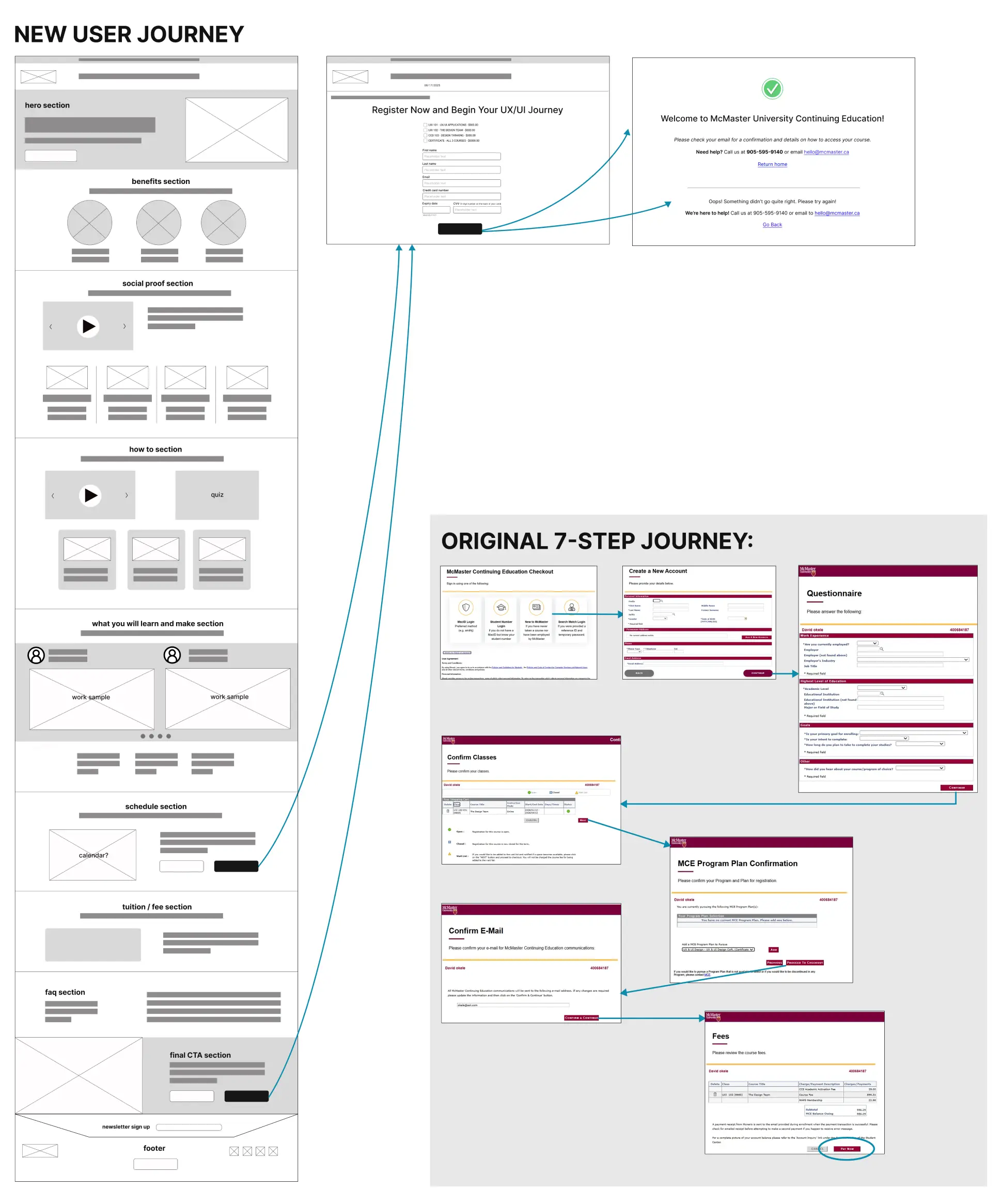
Before and after comparison of McMaster’s registration journey, reducing a fragmented 13-step process to a streamlined 3-step flow.
Outcome and Impact
The redesign transformed a fragmented enrollment experience into a single, structured journey. Five disconnected entry points became one destination, while a 13-step registration process was redesigned into a single guided experience. Together, these changes reduced unnecessary friction and made it easier for prospective students to evaluate the program and complete enrollment with confidence.
3x
faster access to key program information
86%
reduction in registration steps (from 13 to 1)
50%
fewer decision points before registration

Hero and program overview page introducing the redesigned UX/UI program with a clear value proposition, streamlined messaging, and a prominent call to action.
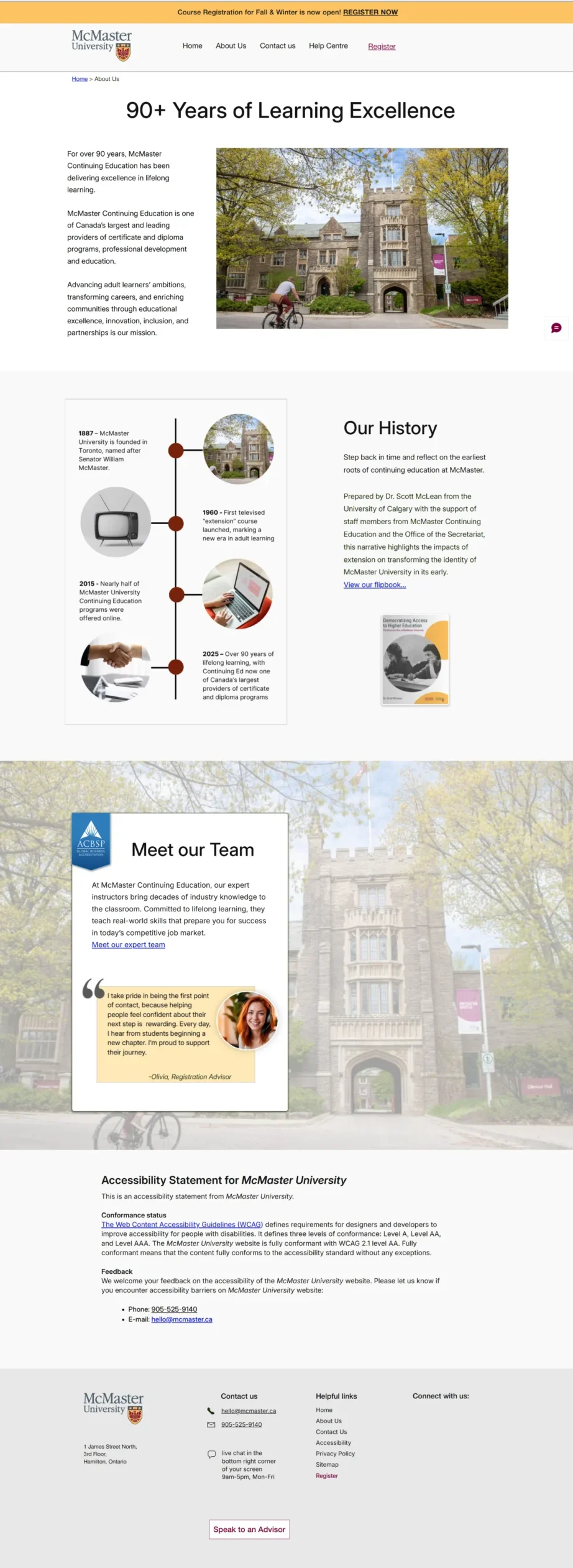
Credibility page highlighting McMaster’s history, educational legacy, and team, reinforcing trust and institutional authority within the redesigned experience.
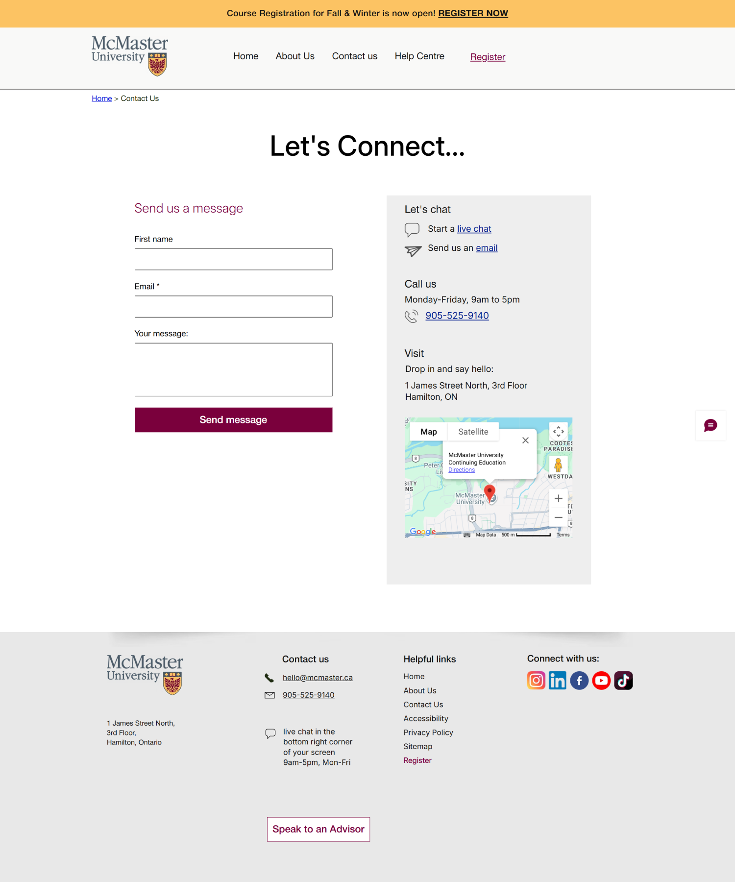
Contact page designed to simplify outreach, featuring a clean inquiry form, location details, and multiple support channels for prospective students.
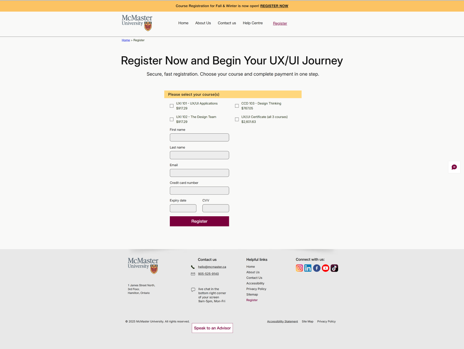
Streamlined registration form consolidating essential fields into a clear, accessible layout that reduces friction and supports quick enrollment.


Desktop and mobile mockups of the redesigned McMaster UX/UI program page, showing a simplified registration flow, clear value propositions, and responsive layout for prospective students.
What I Learned
This project reinforced that reducing friction isn’t only about shortening journeys, it’s about increasing confidence. Simplifying registration mattered, but helping prospective students understand the value of the program before asking them to commit proved equally important.
This project also highlighted how psychological barriers such as self‑doubt, fear of failure, and uncertainty around value can be just as influential as functional friction. Thoughtfully placed social proof, transparent expectations, and supportive microcopy addressed concerns that no information architecture change alone could solve.
It also strengthened my belief that accessibility, emotional design, and clear information architecture aren’t independent considerations. Together, they create experiences that feel trustworthy, inclusive, and easier to complete.
Future Steps
- A/B test hero imagery, headlines, and secondary CTAs
- Develop a digital companion tool: course map, schedule, and accessibility information, to extend the experience beyond enrollment
- Measure registration completion, abandonment, and conversion rates to validate the redesigned experience and identify further optimization opportunities.
Let’s Build Something
That Matters
If you’re building thoughtful systems, digital or physical, I’d love to hear from you.