
Building a Scalable
Brand System
From a single olive label to national retail distribution. A brand system designed to grow with the business.
My Role
Brand Designer
Scope
Brand identity, packaging system, visual guidelines, production-ready assets
Tools
Adobe Creative Suite
Timeline
Multi-year engagement
TL;DR — A single olive label request revealed a brand that wasn’t ready for retail. What followed was a multi-year engagement building a complete identity system, from logo to packaging to vehicle signage — that ultimately reached the shelves of Loblaws, Sobeys, Longo’s, and four other major Canadian grocery chains.
The Opportunity
There was no formal brief, just a request for a single olive label. But as soon as I started working, it became obvious that the label wasn’t the real problem.
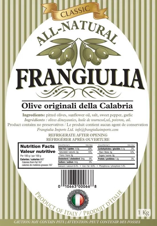
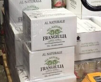
Frangiulia Imports was stepping into major retailers without a brand identity built for retail. The existing packaging lacked consistency, hierarchy, and the regulatory clarity needed for national distribution. And with more products on the way, the system needed to be built for growth from the start.
Constraints & Considerations
- Retail shelf visibility and legibility across multiple product categories
- Health Canada food labeling requirements and UPC integration
- Scalability across multiple SKUs and formats
- Budget-conscious production decisions
- Tight timelines — new products launched incrementally
- Consistency required across all future touchpoints
Research & Discovery
Before opening Illustrator, I needed to understand where this product would actually live. So I walked the grocery aisles. I studied how olive brands competed for attention — who relied on photography, who leaned on heritage cues, who disappeared entirely on shelf. I compared label shapes, colour palettes, and hierarchy patterns across price points. I dug into regulatory requirements… everything from nutrition-panel sizing to bilingual content and mandatory phrasing.
The goal wasn’t to gather insights. It was to see the constraints and opportunities the brand would have to live with in the real world.
Strategy
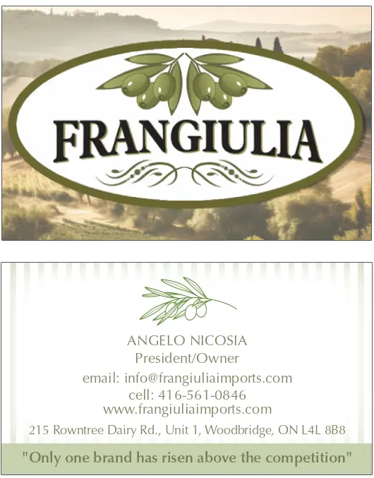
The strategy started with the logo. Before I could design a label system, I needed to define the visual language the brand could build on. The logo became the anchor for everything that followed: typography, colour direction, hierarchy, and the balance between artisanal warmth and retail clarity.
From there the approach was simple: build a brand foundation, not a one-off label. Every decision had to work across current and future formats without requiring a redesign each time. The brand needed to feel rooted in heritage, but read cleanly at a distance, survive harsh lighting, and meet retailer expectations.
Design Approach
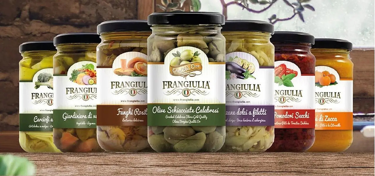
The brand evolved alongside the business, expanding into a packaging system, and eventually into a full retail-ready operation. Each phase built on the last.
Phase 1: Defining the brand’s voice
Everything began with the logo. I needed a visual anchor before designing anything else. Something that captured the company’s Italian heritage and set the tone for the entire system.
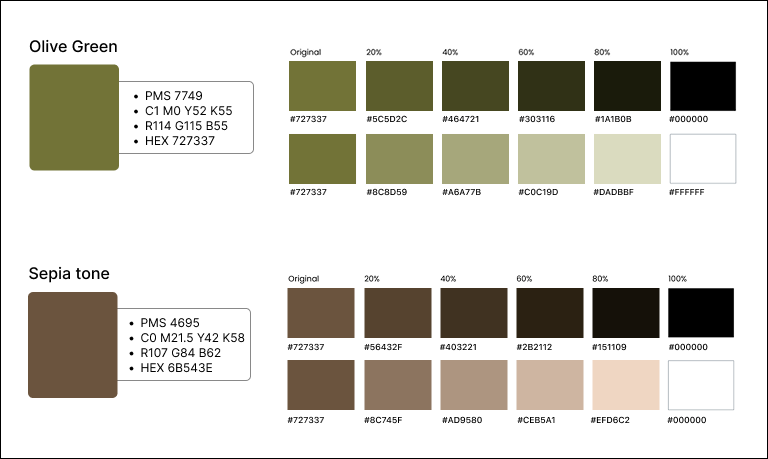
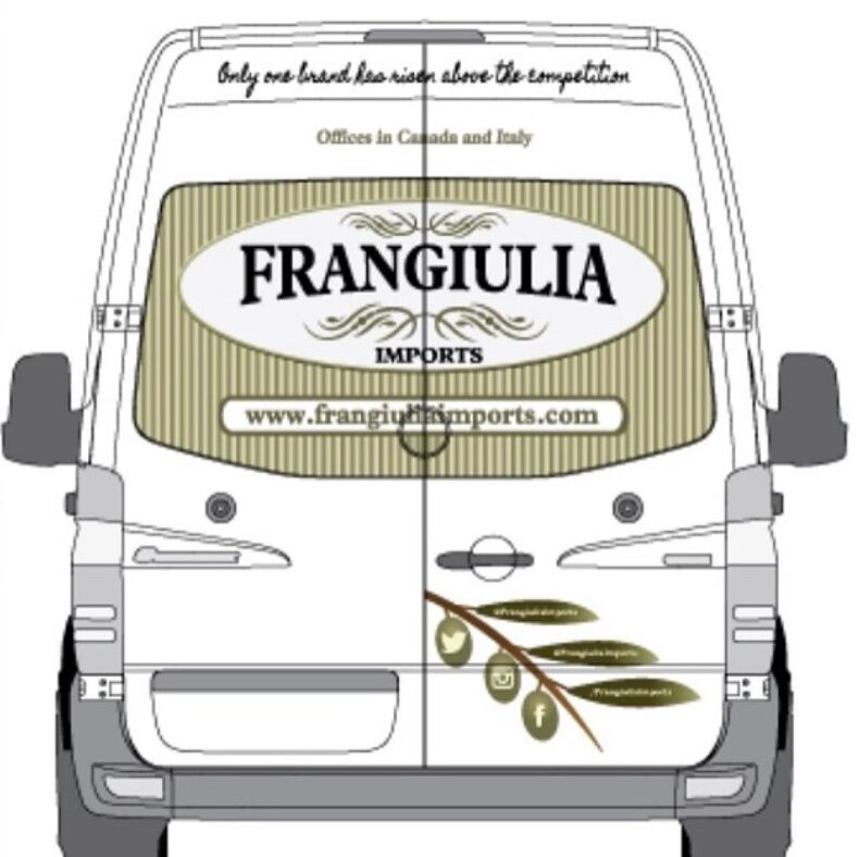
From that came the core visual language: muted olive greens, warm neutrals, and typography that balanced tradition with retail clarity. Those early decisions informed everything from the first product labels to business cards and vehicle signage.
Colour Palette
Typography
Plantin Pro Bold

- Used for: Wordmark/
brand name - Characteristics:
A classic serif evoking Old World Italian craftsmanship.
Optima

- Used for: Body copy and product descriptions
- Characteristics:
Humanist, elegant, and consistently legible at small sizes.
Phase 2: Turning identity into a system
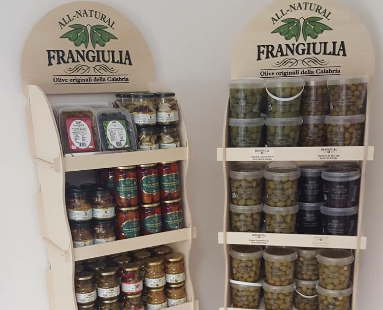
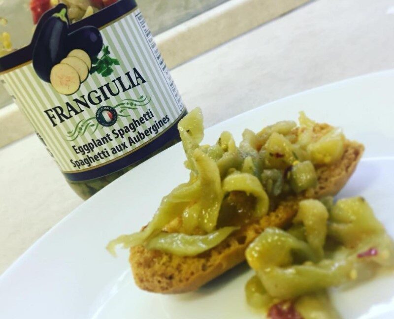
As the product line expanded, the identity had to become a system. I refined the visual language into a modular framework supporting multiple SKUs and formats without reinventing the design each time. Labels, cartons, and supporting artwork were built on a shared structure — consistent where it mattered, flexible where it needed to adapt.
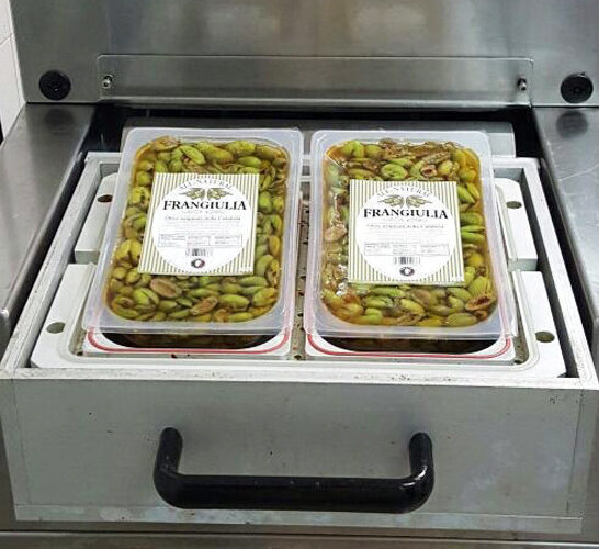
Phase 3: Preparing for retail scale
Retail distribution introduced a new layer of requirements. SKU planning, UPC creation, bilingual content, and production constraints all had to be integrated into the system.
This phase required stepping beyond visual design into operational territory — UPC registration, SKU architecture, and production constraints that directly affected how the brand could be printed, stocked, and distributed. I standardized the technical components, tightened the hierarchy, and ensured every piece of packaging could survive real retail conditions: harsh lighting, crowded shelves, and both retailer and Health Canada compliance.
Outcome & Impact
The Frangiulia identity expanded across packaging, business materials, vehicle signage, and retail infrastructure, maintaining visual consistency across every touchpoint as the product line grew.
The system was built to adapt as new products, SKUs, and formats were added, without requiring a redesign each time. It supported Frangiulia’s shift from wholesale to retail while providing the structure needed for long-term growth.
Frangiulia products now appear in:
Longo’s · Fortino’s · Loblaws · Sobeys · Pusateri’s · Foodland
Impact:
- Grew from a single SKU to a full multi-product retail line
- Achieved placement in 7 major Canadian grocery chains
- Built a system that scaled across multi-year growth without a redesign
What I Learned
This project deepened my understanding of long-term brand stewardship. Designing for a growing business meant listening, adapting, and balancing creative intent with practical execution so the work remained useful, sustainable, and true to the brand over time.
It reinforced the value of designing systems, not just one-off solutions. What started as a single labelling request grew alongside the business, and the brand had to stay flexible, consistent, and operationally realistic as new products, formats, and constraints emerged.
Strong brand design is as much about restraint and foresight as it is about aesthetics. Early decisions around typography, colour, and structure made it possible to scale the brand without repeated redesigns, supporting real-world needs like retail legibility, SKU management, and regulatory requirements.
Let’s Build Something
That Matters
If you’re building thoughtful systems, digital or physical, I’d love to hear from you.