
Program Redesign: Simplifying the Student Journey
Transforming a fragmented registration process into one clear, accessible experience that supports prospective students from discovery to enrollment.
My Role
UX/UI Designer
Tools
Figma, Miro, Adobe Photoshop
Timeline
3 weeks
Methodology
Stanford Design Thinking
TL;DR — McMaster’s UX/UI program website scattered essential information across multiple pages and buried registration behind a 13-step flow. Redesigned as a single consolidated experience — reducing registration steps by 86%, improving information access, and creating a more confident path to enrollment. Several recommendations were adopted by McMaster following submission.
The Opportunity
McMaster University’s UX/UI program website made an already significant decision harder than it needed to be. Essential program information was scattered across multiple pages, each with its own hierarchy, tone, and navigation. The registration process was even more fragmented: a 13-step, multi-page flow that introduced friction at every turn and led to high abandonment.
Prospective students couldn’t easily understand what the program offered, how long it took, what it cost, or how to register. The visual design felt dated and inconsistent with McMaster’s brand, weakening trust at the exact moment users needed clarity and reassurance.
This redesign was an opportunity to remove friction, consolidate information, and create a single, confidence-building journey from initial interest to enrollment.
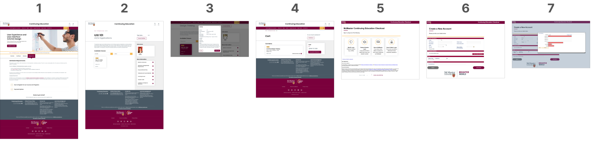
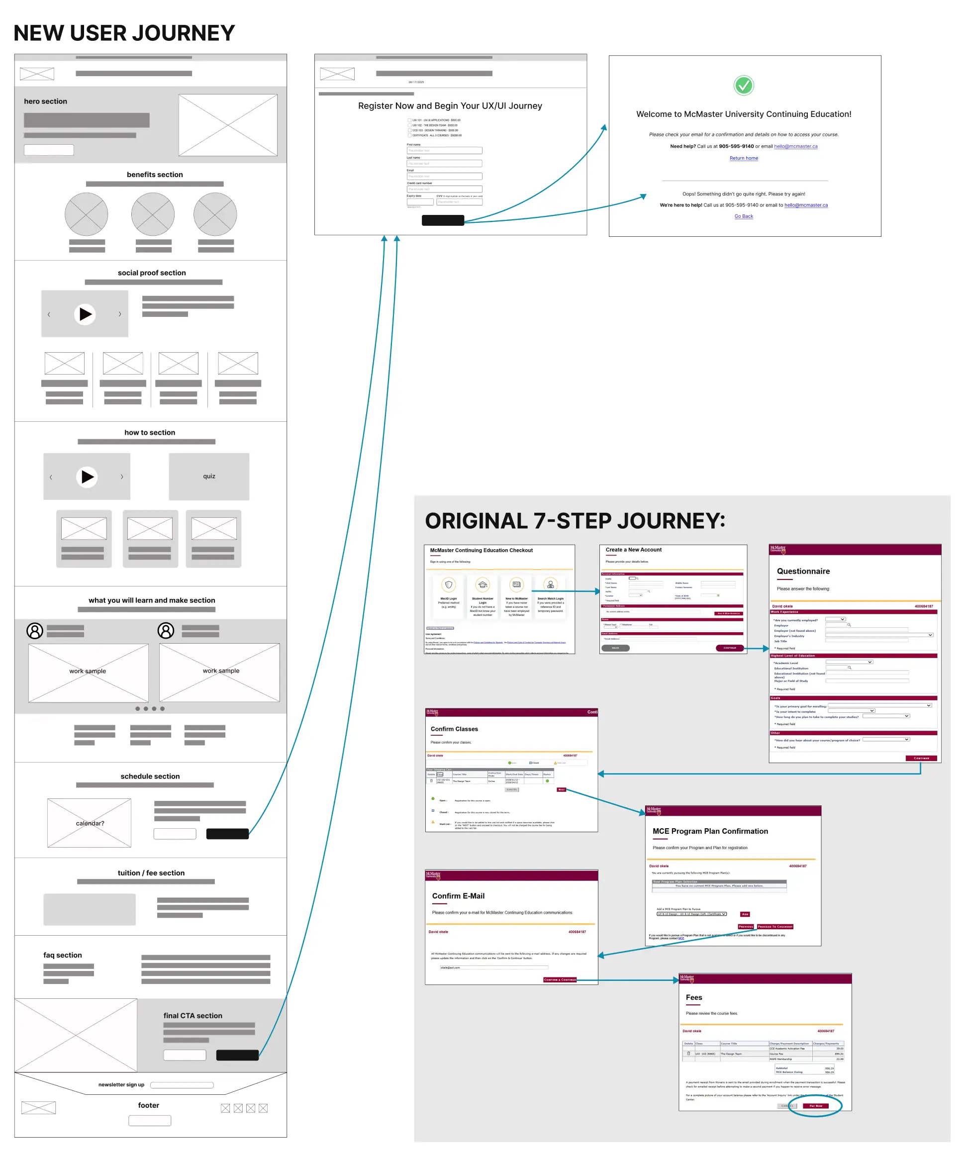
The original registration flow spanned 13 separate, sequential pages, creating unnecessary friction and a high abandonment risk. It offered no breadcrumbs, no autofill for key fields (such as address), and relied on non‑UX‑friendly error messages, all of which compounded cognitive load and user frustration.
Fragmented entry points: Multiple landing pages for the same program created inconsistent hierarchy, messaging, and brand experience, leaving students unsure where to begin.
Research & Discovery
To understand why users were abandoning the program page and registration flow, I conducted competitive analysis, surveys, and interviews with prospective students.
Methods
- Competitive review: UBC, SFU
- Online survey: 50+ prospective students
- In-person interviews with working professionals
- Sorting and clustering of internal findings
What the research revealed
Fragmentation was the primary problem. Not any single page, but the absence of a single source of truth. Working professionals needed curriculum, cost, and timeline information immediately, before committing time to registration. Trust and credibility signals were absent at exactly the moments users needed reassurance most.
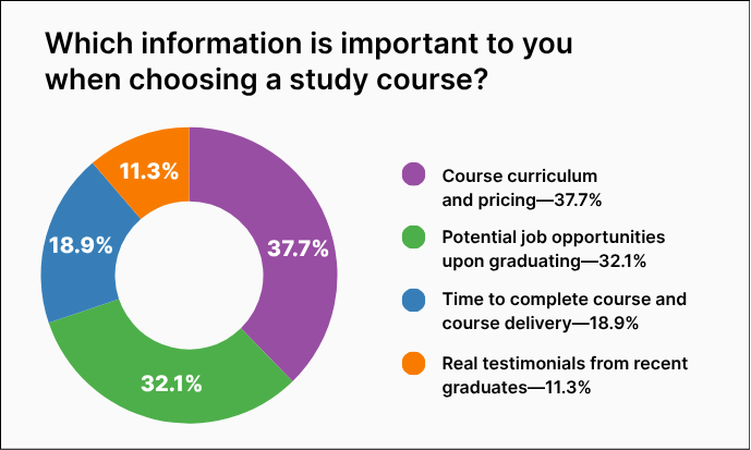
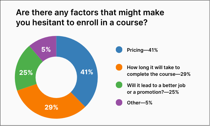
*In keeping with UX best practices, these charts use only high contrast, colourblind-safe colours
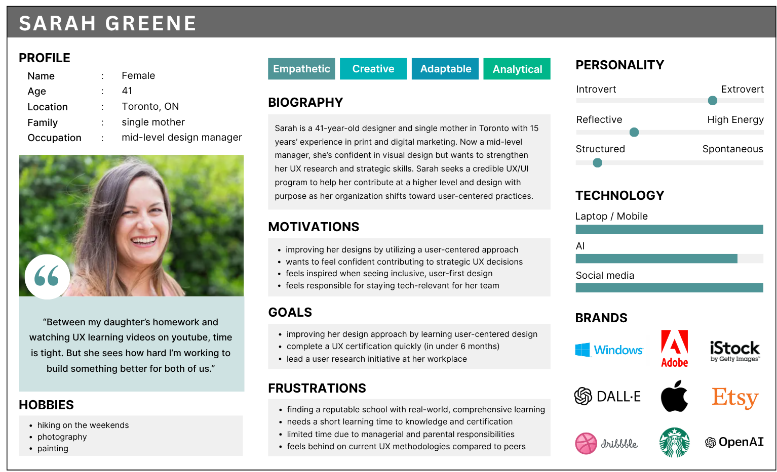
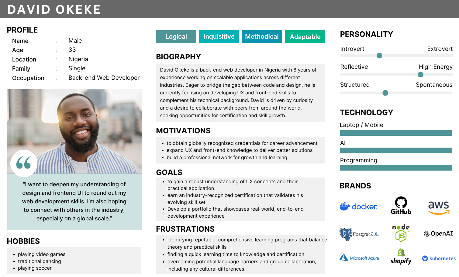
Research findings and personas: Keeping Sarah and David in mind, the goal was to simplify registration, reduce friction, and make the process intuitive for all students.
Strategy
The strategy was simple: one page, one journey, one decision. Rather than sending users through multiple entry points, every key detail from curriculum and cost to timeline, social proof, and registration was organized into one structured experience with a clear sense of order.
Five principles guided every decision:
- Reduce cognitive load by consolidating fragmented content
- Remove friction by simplifying the registration flow
- Support time‑constrained users with clear hierarchy and concise explanations
- Build trust through testimonials, outcomes, and credibility signals
- Ensure accessibility through WCAG-aligned patterns and inclusive design
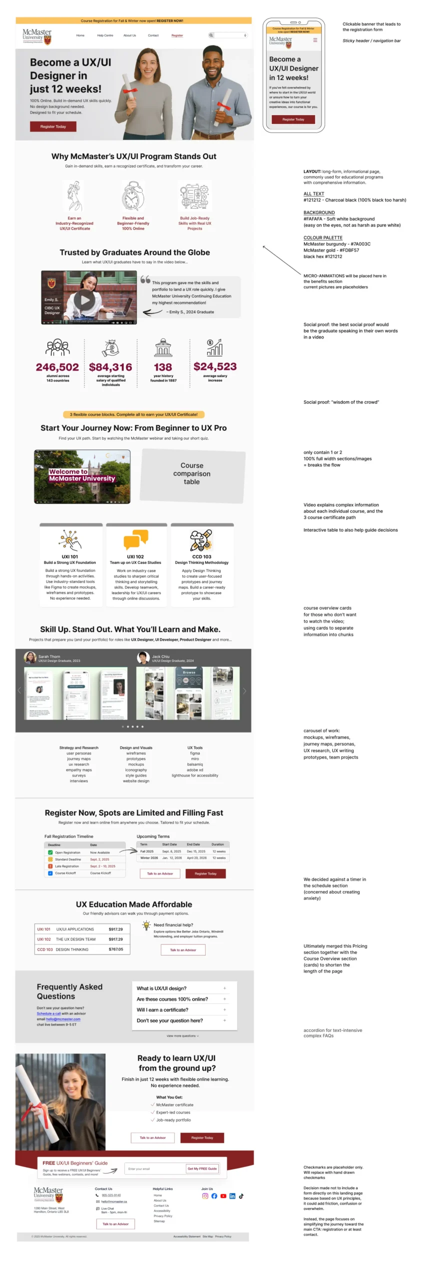
Annotated mockup outlining key design decisions behind the redesigned UX/UI program landing page, highlighting improvements to hierarchy, clarity, and the overall registration experience.
Design Decisions
Every decision directly addressed a barrier identified during research.
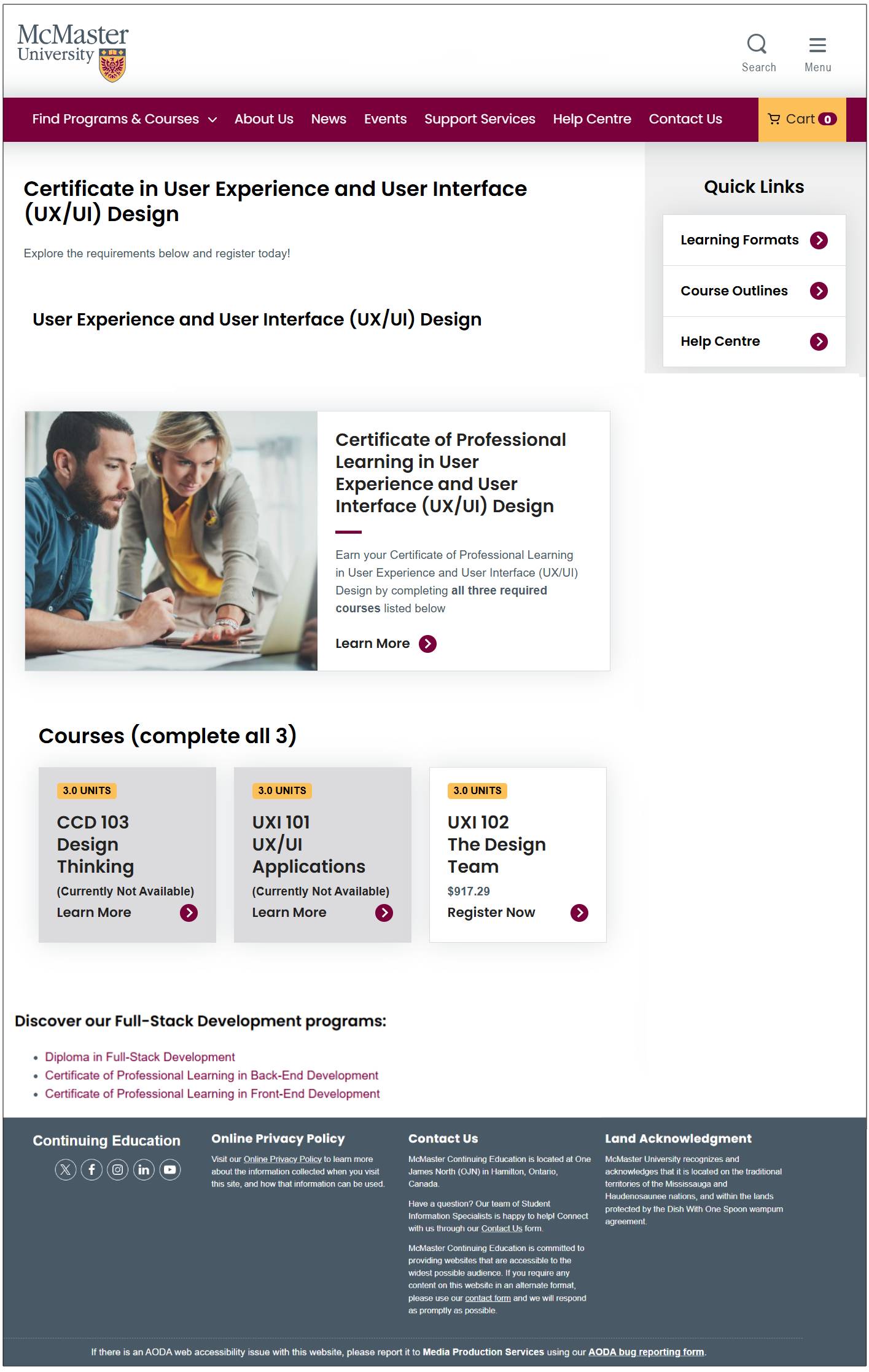
Information Architecture
One page, one journey
Hero → Benefits → Social Proof → How It Works → FAQs → CTA. Credibility before commitment, mirroring how trust actually builds.
Registration Flow
13 steps → 1 guided experience
Single linear flow, essential fields only. Error messages rewritten to be human, not technical. How a form responds to mistakes is part of the trust conversation.
Cognitive Load
Cart icon removed
Retail framing increases pressure at the exact moment users need reassurance. Removed per Hick’s Law — fewer choices, faster decisions, less abandonment.
Emotional UX
Schedule without a timer
Timers manufacture urgency through anxiety… damaging for adults managing fear of failure. Dates listed, pressure withheld. Momentum, not manipulation.
Content & Imagery
Non-classroom imagery
Asynchronous learners need to see themselves in the program. Non-classroom settings signal flexibility. A/B tested against aspirational imagery.
Accessibility
Designed in. Not bolted on.
WCAG AA throughout. McMaster’s palette applied. All media user-controlled. Accessibility treated as a baseline requirement, not a compliance checkbox.
Outcome & Impact
The redesign created a clearer, more accessible experience that reduced friction and supported users from discovery through enrollment. A single consolidated page replaced five fragmented entry points. The registration flow went from 13 sequential steps to one guided experience. Trust signals, accessibility standards, and consistent visual hierarchy were applied throughout.
3x
faster access to key program information
86%
reduction in registration steps (from 13 to 1)
50%
fewer decision points before registration

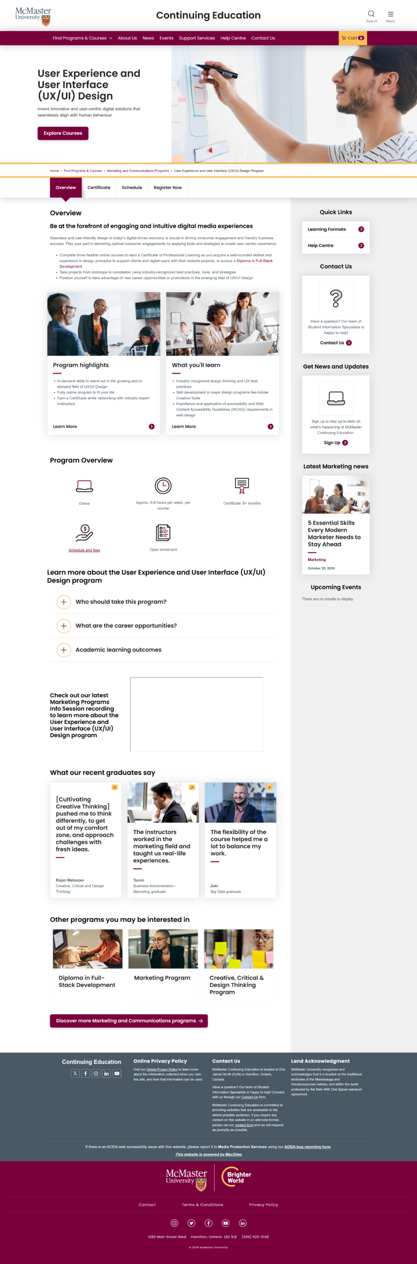
Hero and program overview page introducing the redesigned UX/UI program with a clear value proposition, streamlined messaging, and a prominent call to action.
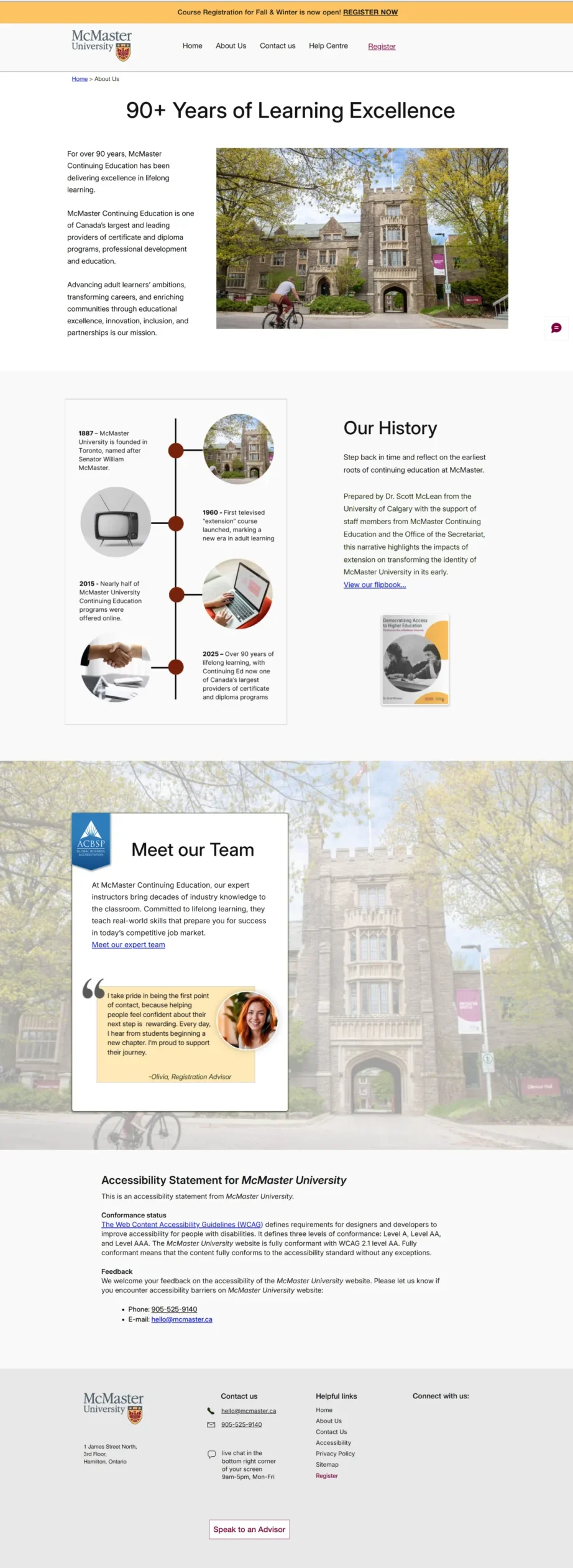
Credibility page highlighting McMaster’s history, educational legacy, and team, reinforcing trust and institutional authority within the redesigned experience.
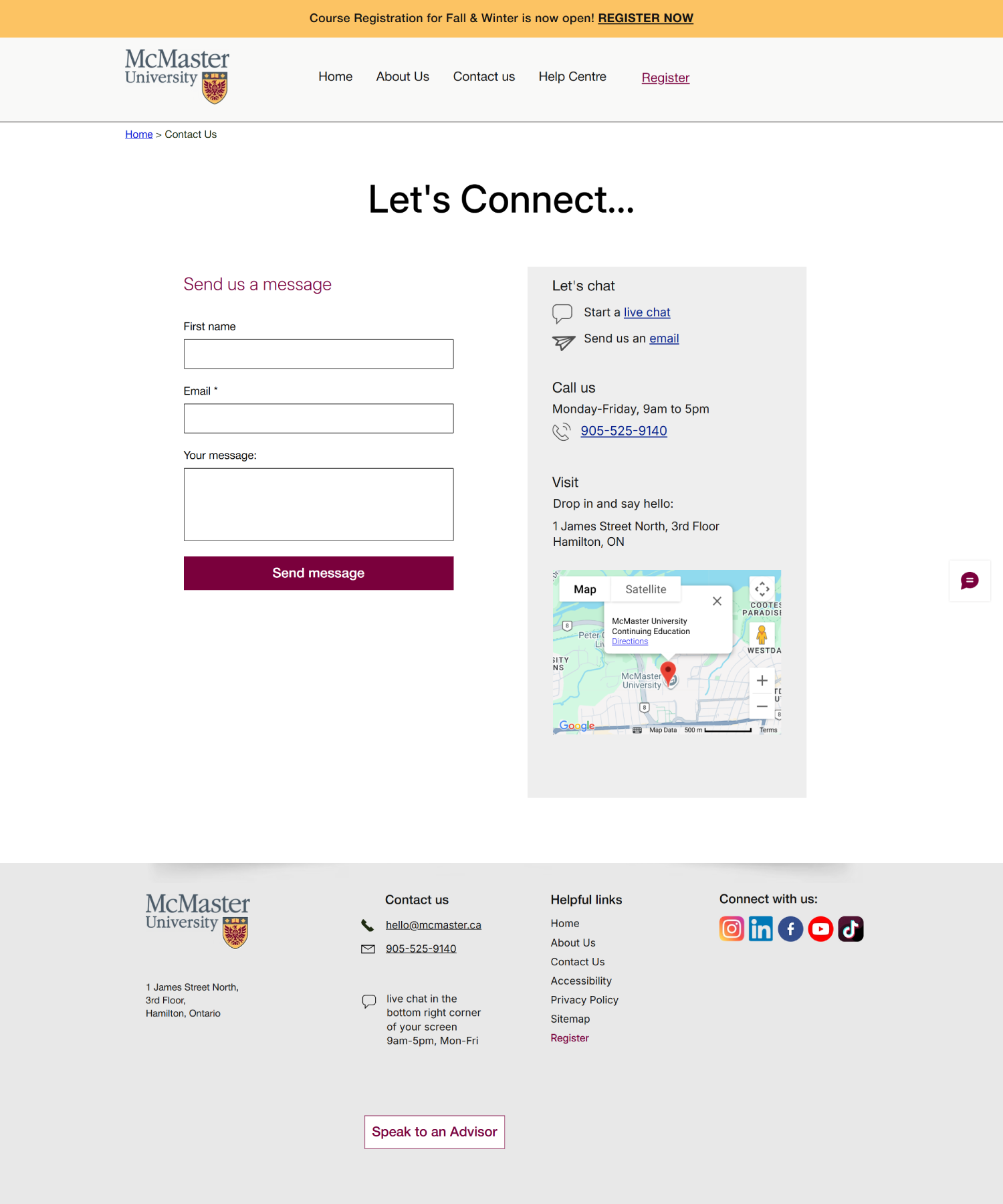
Contact page designed to simplify outreach, featuring a clean inquiry form, location details, and multiple support channels for prospective students.
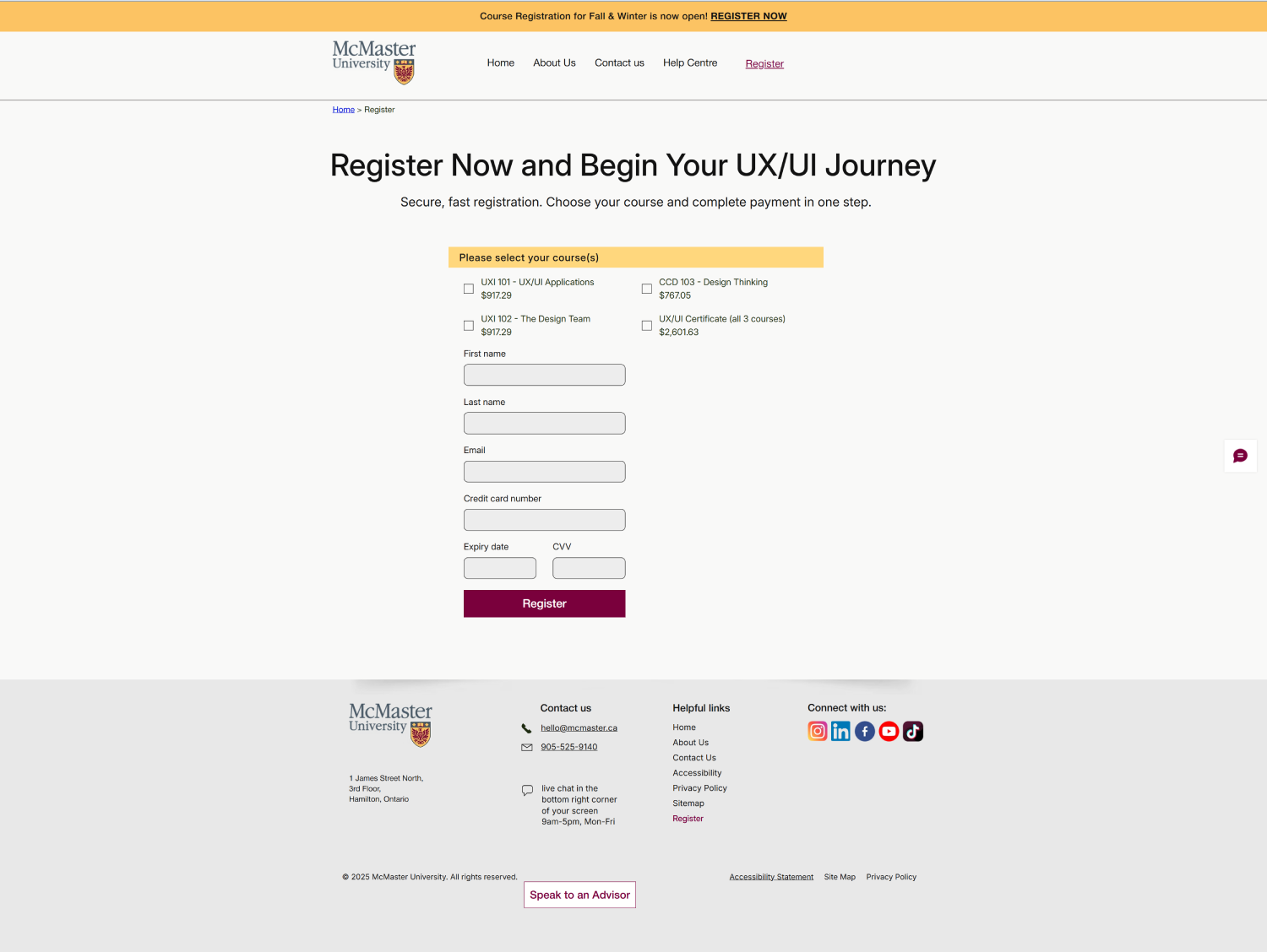
Streamlined registration form consolidating essential fields into a clear, accessible layout that reduces friction and supports quick enrollment.


Desktop and mobile mockups of the redesigned McMaster UX/UI program page, showing a simplified registration flow, clear value propositions, and responsive layout for prospective students.
What I Learned
Effective UX design isn’t only about reducing friction; it’s about supporting user confidence, clarity, and emotional readiness. Consolidating fragmented content into a single structured experience reduced cognitive load, but the more meaningful outcome was giving prospective students the reassurance they needed to make a significant life decision.
Effective UX design isn’t only about reducing friction… it’s about supporting user confidence, clarity, and emotional readiness.
This project also highlighted how psychological barriers such as self‑doubt, fear of failure, and uncertainty around value can be just as influential as functional friction. Thoughtfully placed social proof, transparent expectations, and supportive microcopy addressed concerns that no information architecture change alone could solve.
Designing with accessibility as a baseline strengthened usability for every user, not only those with specific needs. That principle guides every project I take on.
Future Steps
- A/B test hero imagery, headlines, and secondary CTAs
- Develop a digital companion tool: course map, schedule, and accessibility information, to extend the experience beyond enrollment
- Monitor form abandonment and registration metrics post-implementation Continue user testing and refine based on quantitative and qualitative feedback
Let’s Build Something
That Matters
If you’re building thoughtful systems, digital or physical, I’d love to hear from you.