
Repositioning Skin Care for the Direct-to-Consumer Market
Repositioning a retail skin care brand for direct-to-consumer. Redesigned around trust, accessibility, and the needs of seniors.
My Role
Sole designer responsible for the end-to-end brand and visual system, from initial retail launch through a full pivot to direct-to-consumer.
Scope
Brand identity, packaging, regulatory-compliant labeling, direct mail and magalogs, catalogues, digital advertising, landing pages, and web visuals — delivered as a unified system across print and digital.
Tools
Adobe Illustrator, Photoshop, and InDesign for identity and large-scale print systems.
Methods
Audience-specific design, accessibility-first typography, iterative A/B testing across channels, customer surveys, and performance-informed refinement.
TL;DR — A retail skincare brand built for shelf presence pivoted to direct‑to‑consumer, where seniors couldn’t read it, didn’t trust it, and weren’t buying it. I redesigned the entire system around accessibility and trust, achieving a 4–6% response rate against a 1–2% industry average, 400% ROI, and distribution across two countries.
The Opportunity
The challenge was to build trust for an unfamiliar skincare brand targeting adults 60+, a group that is both highly discerning and saturated with health and beauty claims. Agein had originally been developed for retail, where dark, minimalist packaging performed well on shelf. But when the business shifted to a direct‑to‑consumer model, those same aesthetics failed in mail and digital contexts, where clarity, accessibility, and credibility matter far more than shelf impact.
Without the reassurance of picking up a product in‑store, seniors encountered the brand through direct mail, long‑form catalogues, and landing pages. The design had to address skepticism around skincare promises, meet accessibility needs such as larger type and reduced glare, and perform within the realities of direct‑response marketing, where clarity and credibility directly influence conversion.

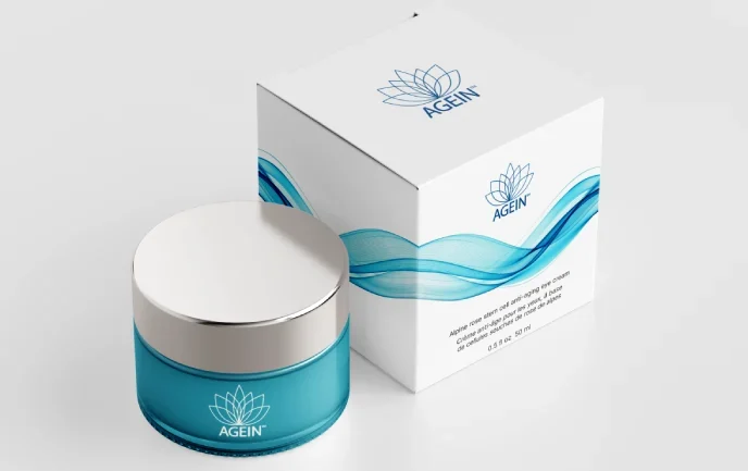
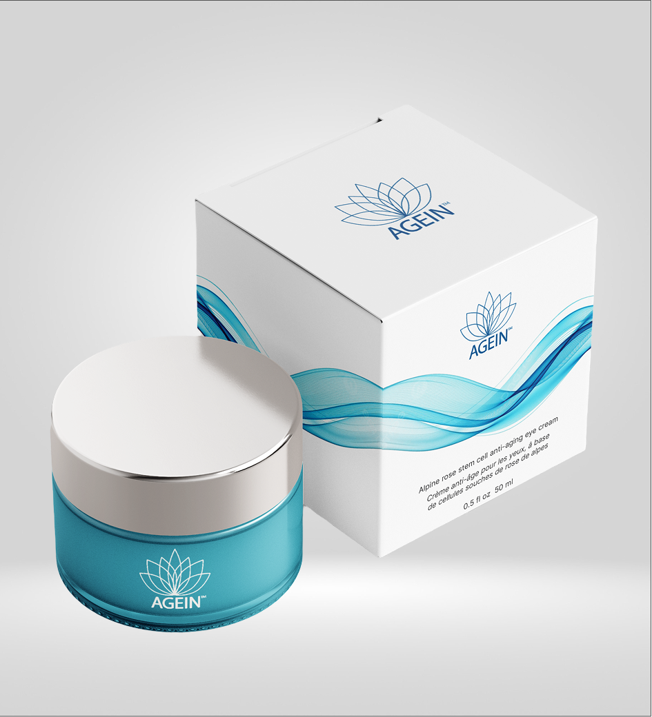
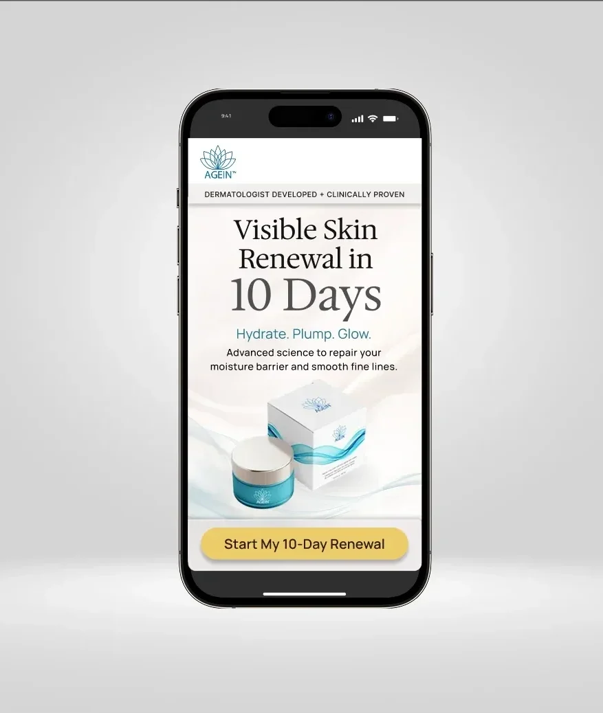
BEFORE + AFTER: Agein’s original black-and-silver retail packaging was redesigned into a trust-driven direct-to-consumer system for seniors. Dark, minimalist aesthetics that performed well in-store failed to translate in mail and digital contexts, prompting a shift toward brighter colors and softer forms that tested stronger for trust, clarity, and perceived hydration.
Constraints & Considerations
- Retail shelf visibility and legibility across multiple product categories
- Health Canada and FDA labeling requirements and UPC integration
- Scalability across multiple SKUs and formats
- Budget-conscious production decisions
- Tight timelines, with products launching in stages
- Consistency required across all future touchpoints
Research & Discovery
Before redesigning anything, I needed to understand how seniors actually engaged with skincare in a direct‑to‑consumer context. I studied the touchpoints they relied on most: direct mail, long‑form catalogues, landing pages, and phone‑based ordering. I reviewed competitor mailers, analyzed common claims and visual patterns, and noted where brands lost credibility through clutter, small type, or overly cosmetic aesthetics.
I also observed how older adults interacted with printed materials in person — how they held them, where their eyes landed first, and how often they struggled with small type or glare from glossy paper. Customer surveys and call‑centre feedback echoed these patterns, revealing skepticism toward bold promises, a preference for familiar visual cues, and a need for clear, readable information without visual noise.
Strategy
Repositioning Agein meant shifting from a retail mindset to a direct‑response system built around trust, clarity, and accessibility. Instead of chasing cosmetic‑industry trends, the brand was repositioned around hydration cues, softer forms, and a palette that tested stronger for trust and perceived efficacy. Every decision was grounded in performance: A/B testing guided refinements, protected brand equity, and ensured the system could scale without losing recognition or clarity.
Design Decisions
Testing showed seniors responded positively to visuals that felt familiar, authentic, and hydration‑focused. The identity shifted from black and silver to a softer palette of teals and blues, supported by organic wave motifs reinforcing moisture and care. The brighter palette also served a practical purpose: teal and blue reproduce cleanly across print and digital, photograph well for product shots, and stand out in a crowded mailbox in a way dark packaging cannot.
Readability and physical comfort were treated as strategic decisions, not aesthetic preferences. Optima and Optima Bold were selected for clarity, body copy increased to 16–18pt, and layouts emphasized clear hierarchy and high contrast. Matte-coated stock reduced glare in print materials — directly addressing issues observed during in-person user research.
Trust was built through repetition. Visual language, messaging, and calls-to-action were aligned across packaging, direct mail, landing pages, and phone-based ordering… so customers experienced continuity regardless of how they first encountered the brand.
Key decisions were validated through systematic A/B testing across direct mail, catalogues, landing pages, email, and digital advertising. When proposed rebrands caused response rates to drop, those directions were abandoned to protect established brand equity. High-performing campaigns were repeated until response declined, then iteratively adjusted rather than replaced.
Technical Execution
I worked with our purchasing agent and Asian manufacturing partners to prepare precise dielines, material specifications, and prepress files, ensuring clarity despite language barriers and long lead times. For domestic print partners, I produced catalogues, magalogs, and direct‑mail formats with clear production notes, colour targets, and finishing requirements to maintain quality at scale.
I worked with our purchasing agent and Asian manufacturing partners to prepare precise dielines, material specifications, and prepress files for the jars and containers, ensuring clarity despite language barriers and long lead times. For Canadian print partners handling the product cartons, catalogues, magalogs, and direct‑mail formats, I produced detailed production spec sheets and finishing requirements, and conducted press approvals to maintain quality and consistency across both supply chains.
Catalogues were sized at 8.5″ × 5.5″ to reduce paper waste and improve readability for older adults. Matte‑coated stock minimized glare, and stitched‑in reply envelopes, pull‑out order cards, and other direct‑response mechanics were built into the layout from the start. I designed digital layouts and campaign assets, collaborating with developers, ensuring a consistent experience across online, mail, and phone‑based ordering.
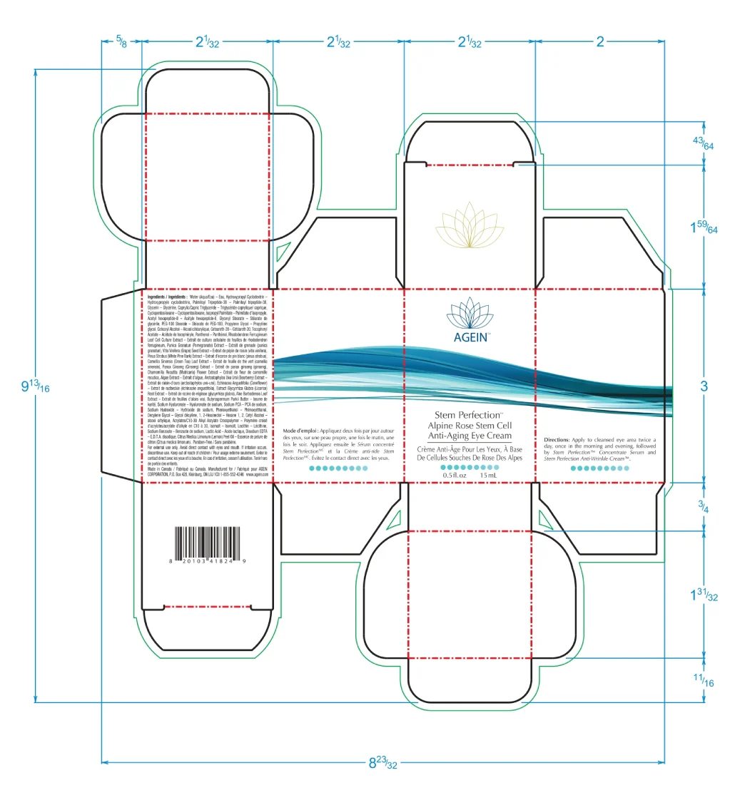
Detailed specifications and documentation ensured consistency and quality across international manufacturing and domestic print production.
PACKAGING

DIGITAL


Design variations were tested across print and digital channels with performance data guiding refinement and protecting brand equity.
Outcome & Impact
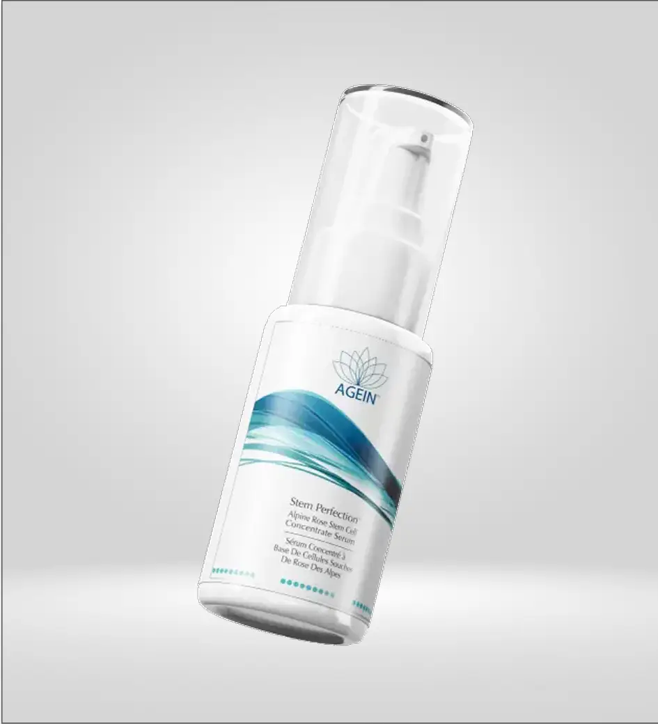
The repositioning supported sustained DTC growth across two countries. The product line expanded from a single moisturizer to a full system built on the same visual and messaging framework. Monthly magalog campaigns ran at 25,000–30,000 pieces, with layouts and messaging refined continuously through testing.
1-2% industry average
campaigns
What I Learned
Working on Agein reinforced how differently a brand must behave when it moves from retail to direct-to-consumer. In retail, packaging can rely on shelf presence and proximity. In DTC, the design has to carry the full weight of trust on its own through print, mail, and screens, without the benefit of an in-person experience.
I learned how critical accessibility is for performance. Larger type, reduced glare, and clear hierarchy weren’t aesthetic preferences — they directly affected whether someone could read an offer, understand a claim, or complete an order. Small decisions around paper stock, contrast, and spacing had measurable impact on response rates.
The project also underscored the value of data-driven refinement. A/B testing didn’t just validate decisions, it protected the brand from well-intentioned changes that would have eroded recognition or credibility. Performance data became a guardrail, not a constraint.
Finally, cross-channel consistency proved critical for a senior audience. When packaging, mailers, landing pages, and phone-based ordering all spoke the same visual language, trust increased.
Let’s Build Something
That Matters
If you’re building thoughtful systems, digital or physical, I’d love to hear from you.